The most respected interactive rap battle experience.
Year
2020
Tags
Branding, UI/UX, Animation
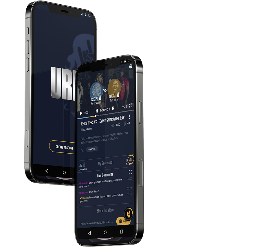
The most respected interactive rap battle experience.
Year
2020
Tags
Branding, UI/UX, Animation
What I worked on
Working closely with the stakeholders, I converted their live event experience into wireframes and interactive prototypes. Then, over the course of several months of iterations, arrived at the final, intuitive product. I also provided branding and assets when needed.
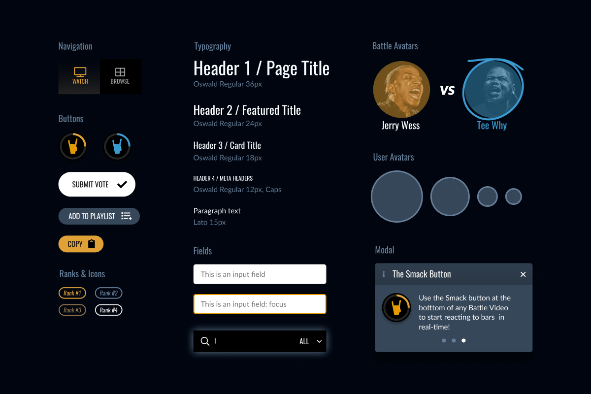
Midnight
#051024

Dusk
#364759
Haze
#E4E4E4
Smack
#FFFFFF
Team Orange
#E0A137

Team Blue
#3B99CF

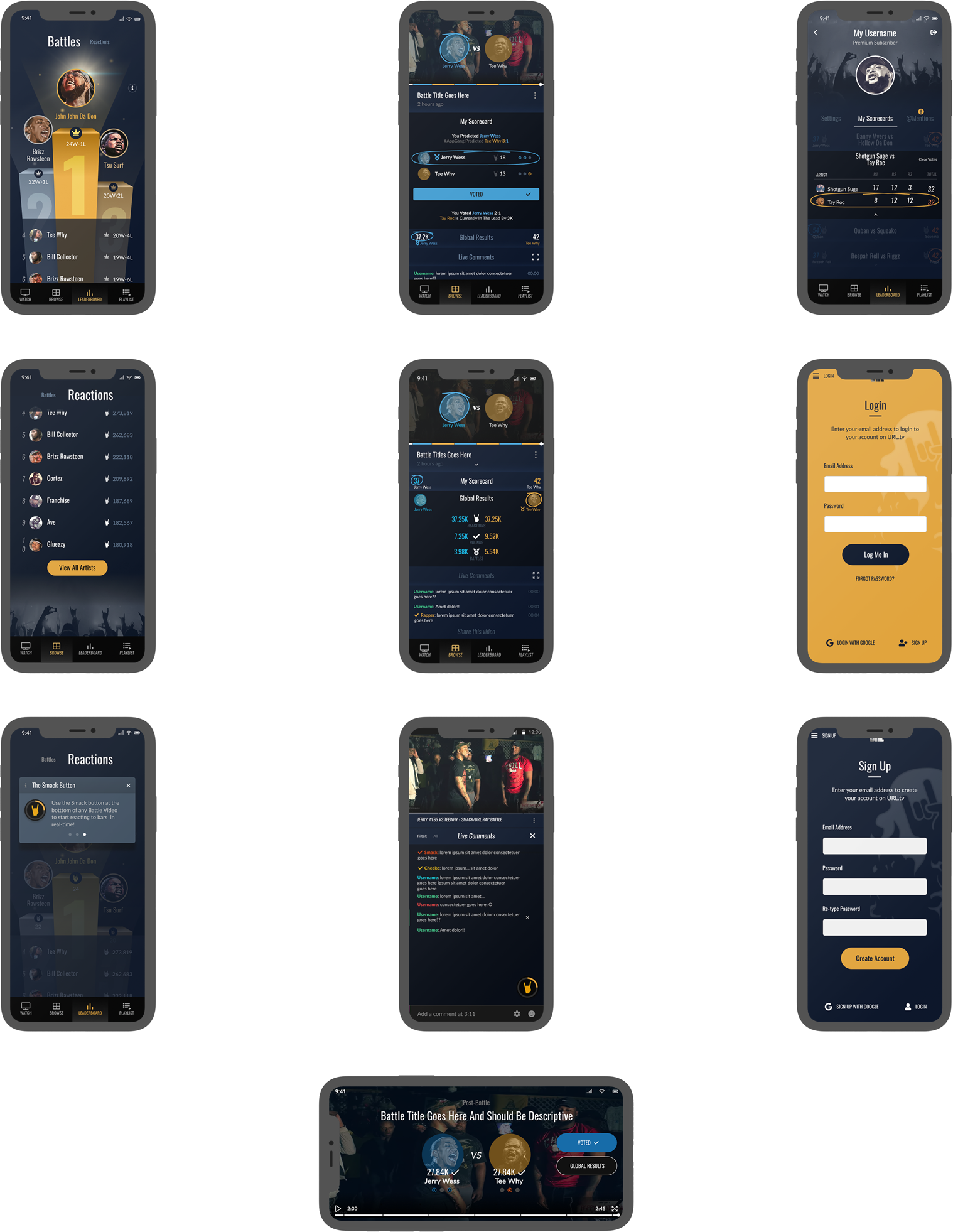
Bringing the magic of live rap battles into a handheld device
How can we capture the street culture and excitement of URL, while leveraging the benefits of the digital medium to improve the end-user’s experience?
Before Design
URL was posting their battles for free on social media. They were wasting their efforts giving their product away for free and struggling to monetize their loyal audience.
Reimagining the thrill of being in a rap battle audience
After studying rap battles and going to a couple of events, I figured the four main elements I needed to embody within the app were:
Live Performance
Community
Interaction
Energy
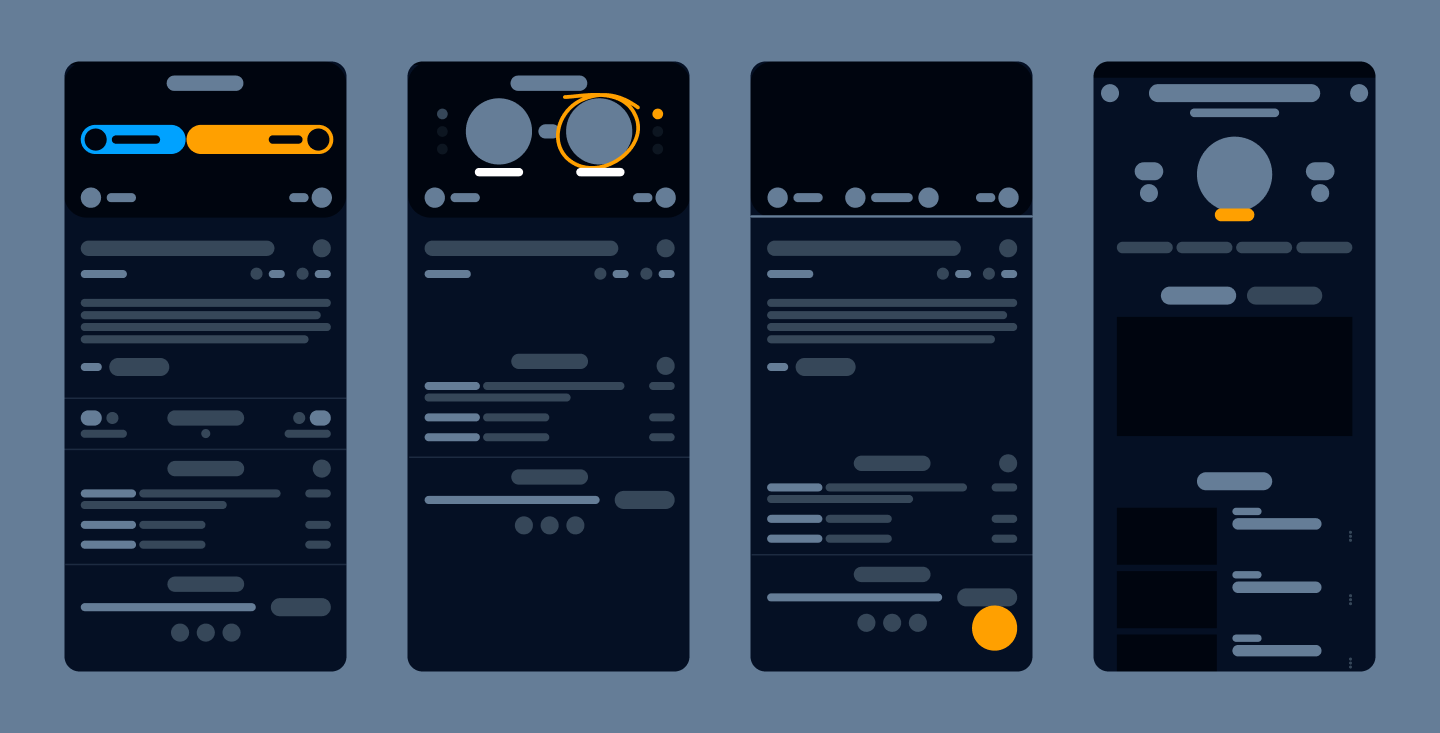
The state of rap battle videos
Hypothesis:
If a user is passionate enough to seek the battles out on social media, then they’re more than likely to care about what the comment section is saying about each round and who they feel like won. Unfortunately, the static comment section was the only way (at the time) to provide that essential feedback to the audience and performers.
The most important exchange at a rap battle is the cheering. After an artist spits a bar, the audience’s job is to show they enjoyed it. There are many moments in a rap battle where the artist even pauses for approval. I decided to bridge that experience gap.

Interactive, hype, and gamified
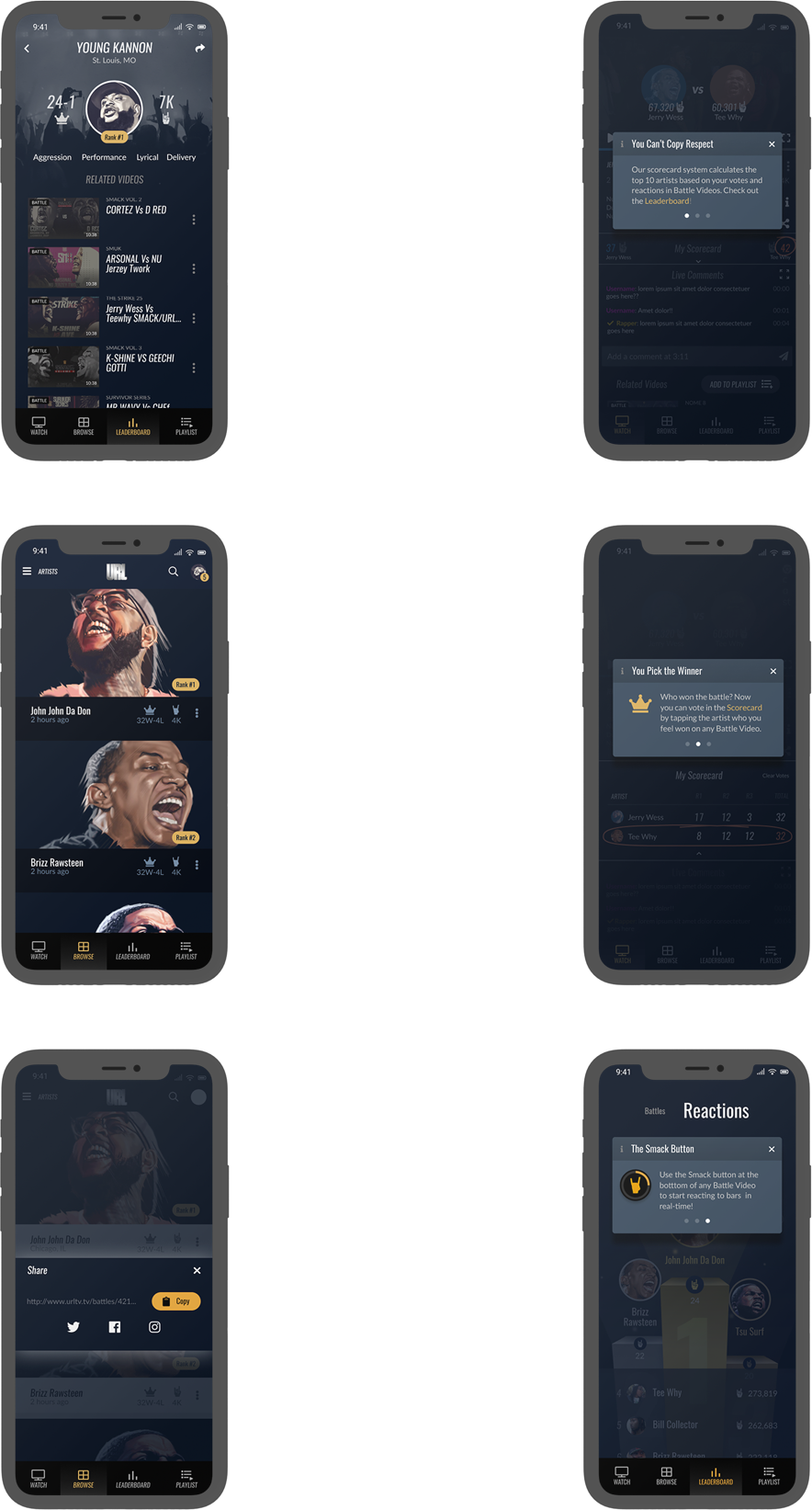
Tap the react button to vote at any time during the round, because cheering is how we show we liked a rhyme.
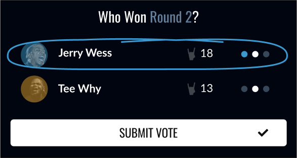
Vote at the end of each round, because we mention who we think is winning so far in between rounds.
Tally up and create an artist leaderboard based on the community’s real-time reactions and votes, because we always debate who the best rapper is – but now we will know.
Video site users like to browse while they watch, so we added a Picture in Picture feature. Below is an early interactive prototype of the PiP in action.
Mobile first, then everything else
After making the mobile app, we put together a desktop experience to increase accessibility including preparing assets for TV apps.
Bring it to life with animation
No better way to bring excitement to the app than with engaging and interactive animation complete with a custom rendered Blender model and After Effects animation.
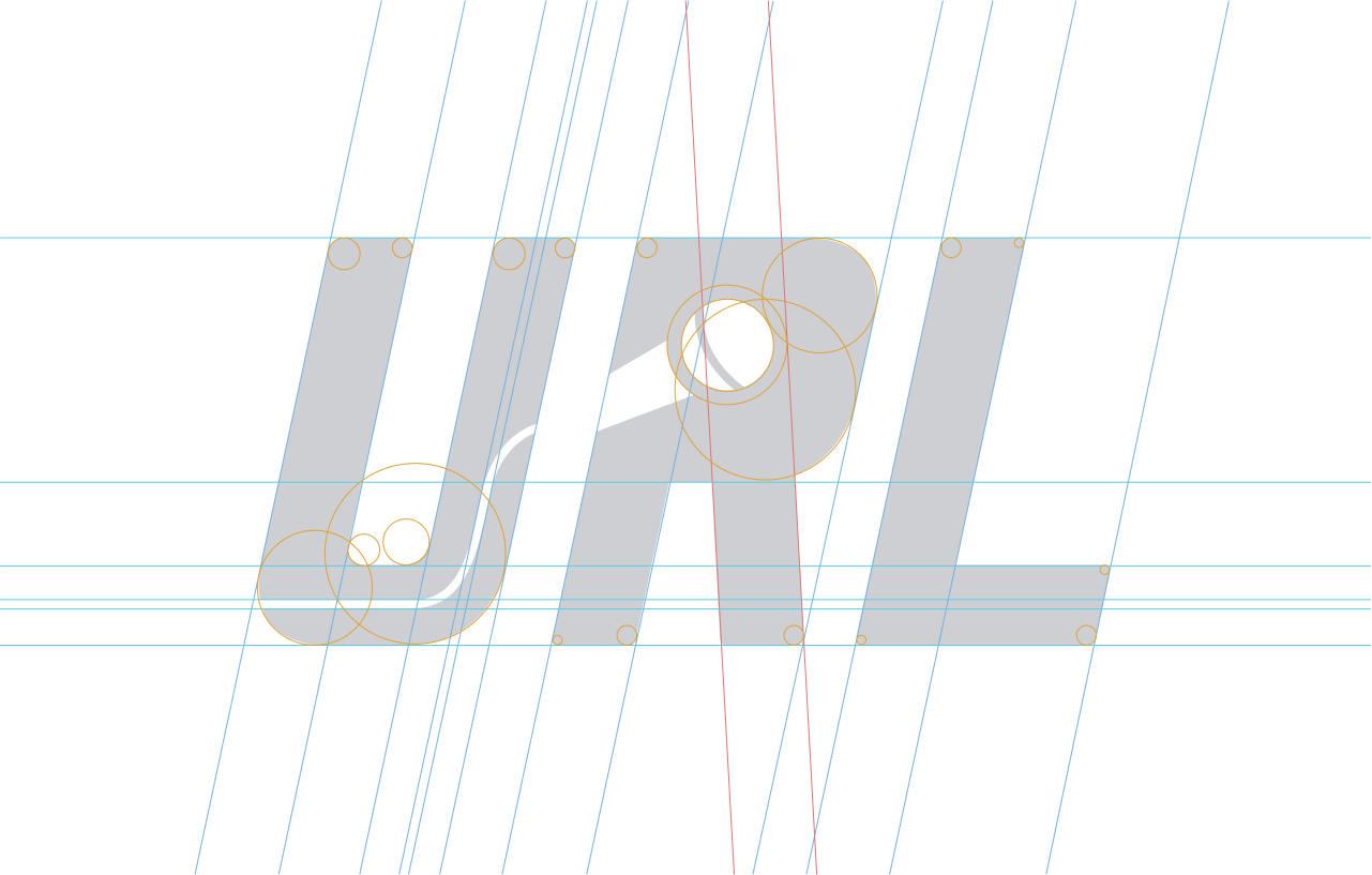
Logo Redesign Concept
In an effort to improve the spacing, legibility, and overall visual messaging with URL’s logo, I created this design concept surrounding “dropping the microphone”. This logo scales much better and would make sure their new fans have something to attach their acronym to. They decided to keep their previous logo, but I still believe this mark is successful.

Over 100,000 Installs on the Google Play Store
Interested in collaborating?
